
cayceP
09/10/2041at 04:41
13 comments
5 annotations

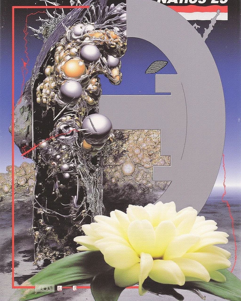
10/10 amazing! where and how did you find this? its so rich.. poster / graphic design / album cover / magazine cover / collage / airbrush / 90s photoshop.. + the overall sun-faded desaturated look.. but also what even is it semantically?
yeah it's really special, i agree.. the sun-faded look is really unique.. it somehow manages to look like an old 80s print.. something about the grain..
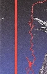
the grain..
ugh.. i wish there was more resolution.. i want to see this more up close..

its also the subtle way the color seems chipped in places..
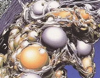
this whole part is so intricate..
this is probably not entirely accurate but my closest reference point is someone like Roger Dean or a similar 70s airbrush artist.. but i'm not sure they would have ever done something so intricate..

yeah i thought of that too.. i think they would have definitely done something as intricate but maybe not so strange, organic and sort of uneven.. but if you stare at this long enough and examine it closely enough it sort of starts to fall apart.. don't you think?
well yeah but the way it falls apart is exactly the interesting part..
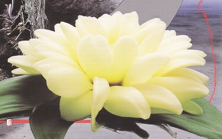
this is so pretty i'm tearing up..
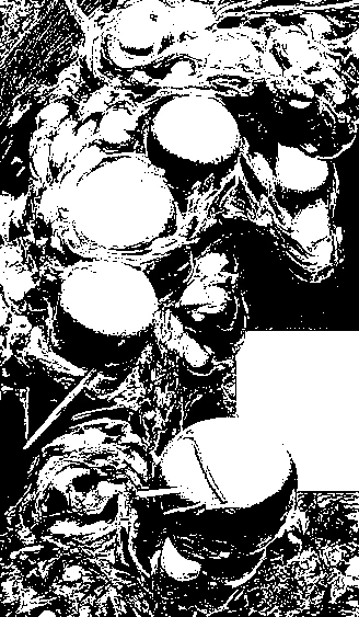
doesnt this also remind you of something?
specifically this kind of linework we've already seen elsewhere.. ? 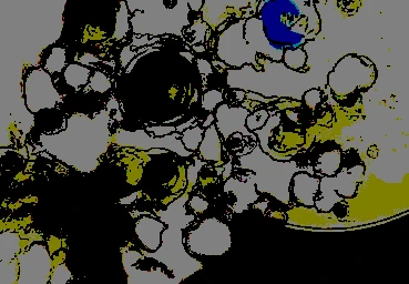
wow, you're right... i mean its not that close but its a similar noisy pattern that gets broken apart by these circular elements.. hm.. this seems to suggest there are underlying compositional or structural patterns that can persist across completely different styles.. i never would have thought to search for a connection between these two artefacts..